Edmonton's Food Bank Rebrand
Edmonton Food Bank Rebrand
Situation
Edmonton’s Food Bank is a very well known charitable organization established in 1981, out of the realization of two factors: hunger as affecting the lives of many Edmontonians and edible food was being wasted in the community.
To this day, Edmonton’s Food Bank has stood firm on its mandate to be stewards in the collection of surplus and donated food for the effective distribution, free of charge, to people in need in our community while seeking solutions to the causes of hunger.
The original logo adopted by Edmonton’s Food Bank was originally drawn on a napkin in a café somewhere in Edmonton and evolved very little from the original concept. That logo consisted of hand-written font, “Feed Edmonton’s” and big blocky letters “Food Bank”.

Task
ThinkTANK has always had close relations with Edmonton’s Food Bank, working with them for over 10 years on various marketing initiatives. When the opportunity arose to work with them in re developing their branding, we leapt at the chance.
Initial conversations with Edmonton’s Food Bank, led the discovery that they were seeking a “more professional” or polished looking brand that would be used in conjunction with their 35th anniversary of incorporation.
Branding Challenges
We wanted to ensure that we not only kept the core values of the Edmonton's Food Bank, but also be able to identify with today's various audiences. The challenges were that they wanted to make sure that the main focus was on identifying with the people in need and ensuring that the Foodbank remained approachable when communicating with media, corporate sponsors and the everyday donor. It was very important that the new brand would reflect the organizations evolution and ability to properly manage resources in the community.
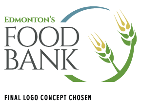
We allowed a certain amount of international and local influence to affect the looks of the concepts from Houston's re branding concepts to the roll out of Australia's Food Bank Aesthetics. The product ended up having a uniquely Albertan feel to it. Incorporating a stalk of wheat that also doubled as fork and the circle being representative of a plate. The colour scheme is developed from the existing colour palette already employed by the Food Bank website, with the the green representing earth, the yellow being wheat, and the blue representing the bright blue Albertan sky.
Process and Strategy
After speaking with Edmonton's Food Bank about what they were looking for in a new look, ThinkTANK took their want for a "more professional" look and ran with it. Many concepts were developed to come up with a final look that embodied all the aspects The Edmonton Food Bank represents.

The final logo was ultimately chosen for it’s cleanliness, and aesthetically pleasing look. The client was very pleased with the final look, and ThinkTANK has continued to assist them in getting the brand out to the public in a positive way that has included truck wrap, new warehouse smocks, Display Advertising, new interior and exterior signage, a 35th anniversary logo and a complete identity system.
 Final Brand Rationale
The logo is a symbolic representation the gift of life. Popularly known as the “circle of life”, it represents the infinite nature of energy: The death and decline of starvation and new life given to another through food and nourishment.
Grown from the circle, are blades of wheat which symbolize love and charity. Wheat is also a representation of our the natural resources of the province of Alberta, and Edmonton as it’s capital city. The logo evokes youth, nature, charity, and our way of giving back life to Edmonton and Alberta.


