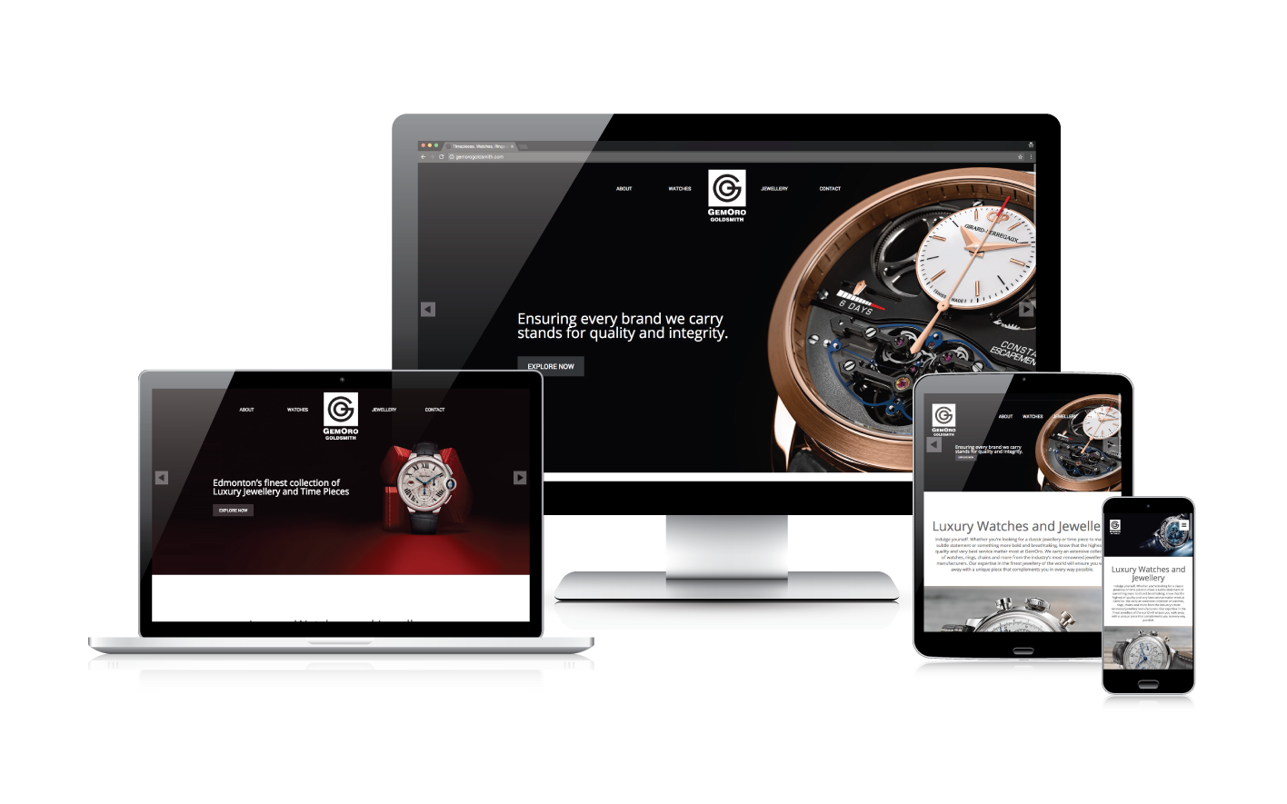
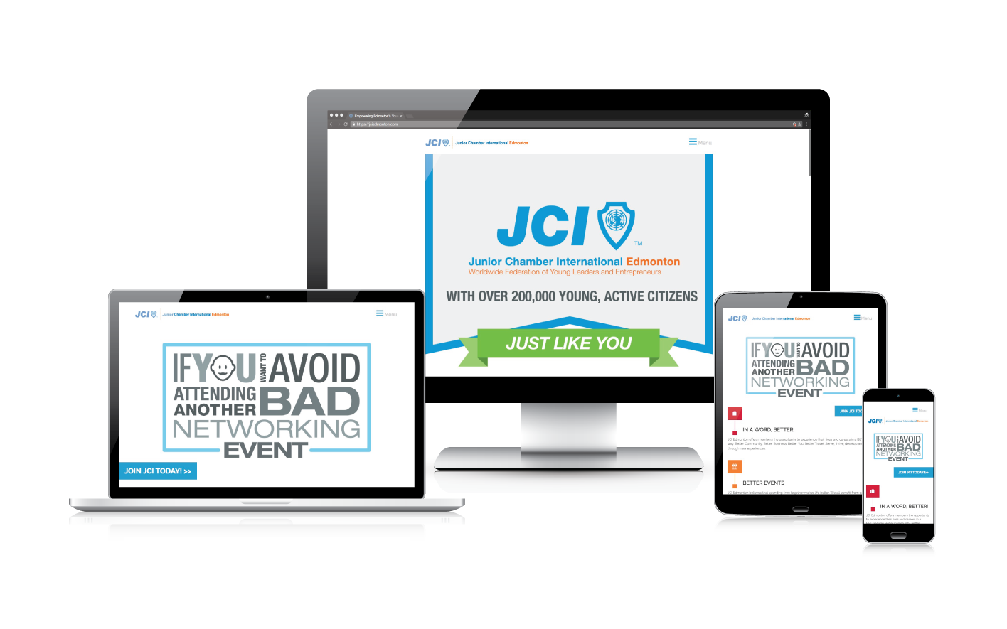
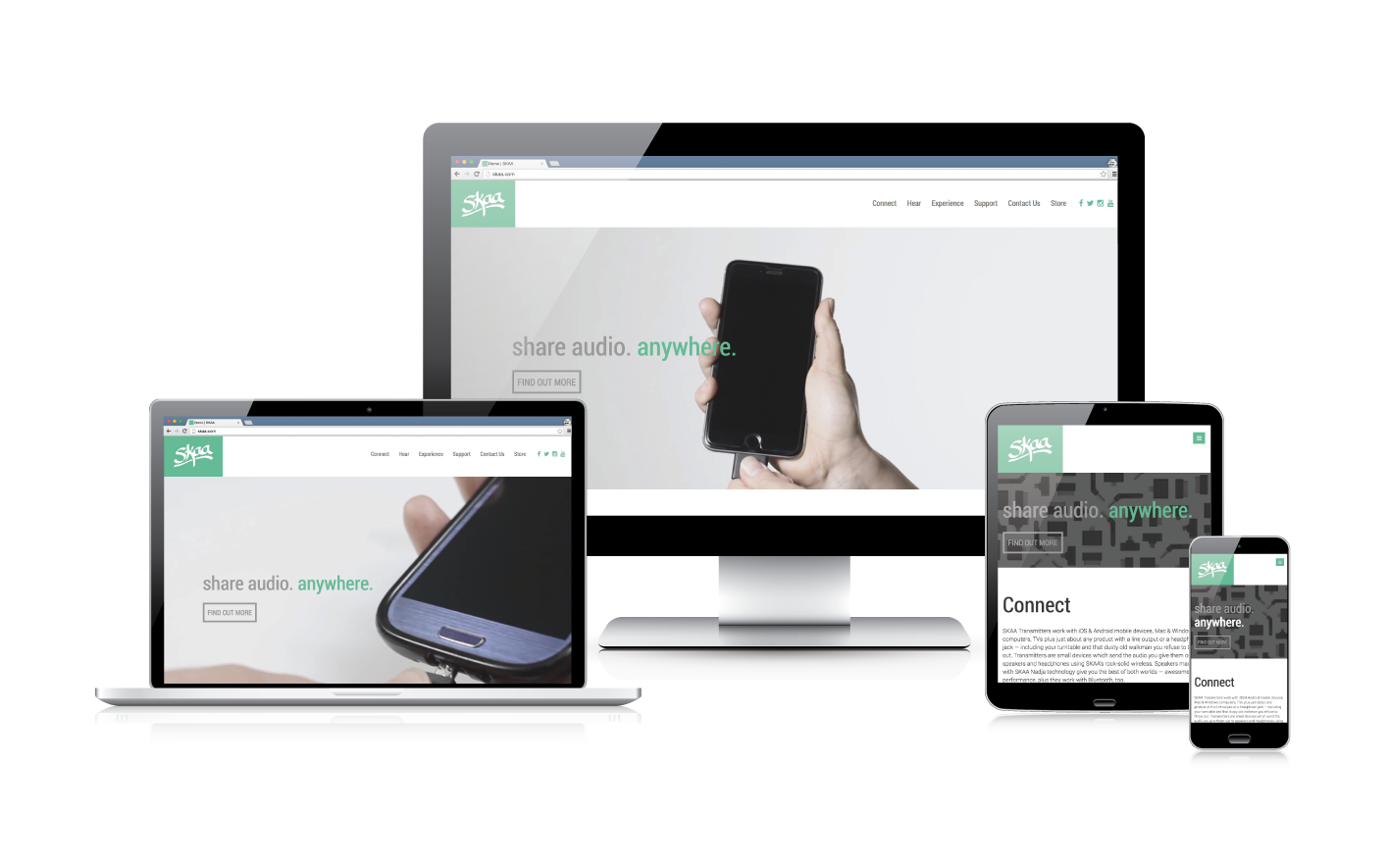
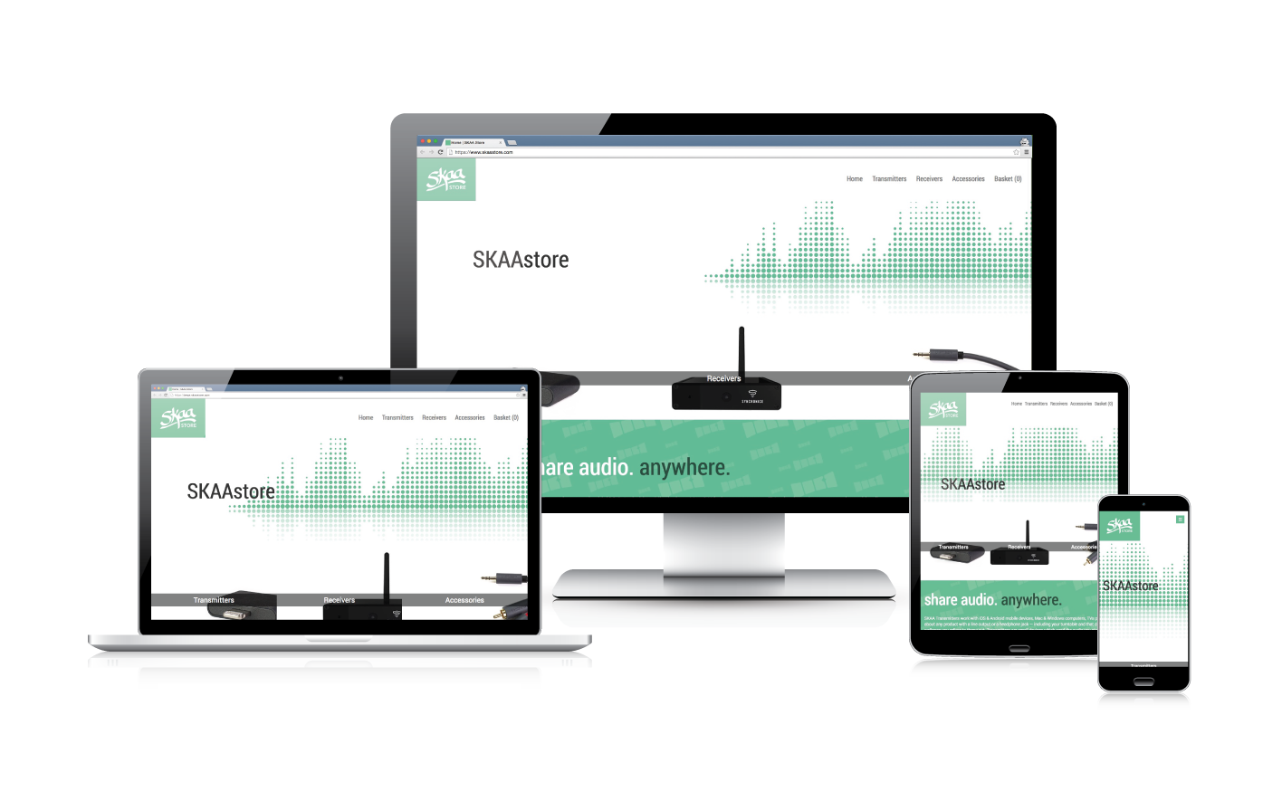
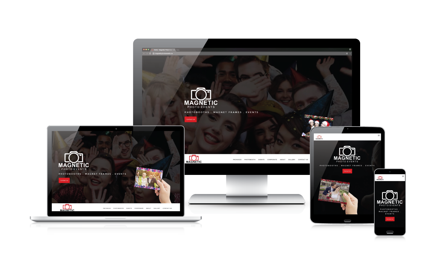
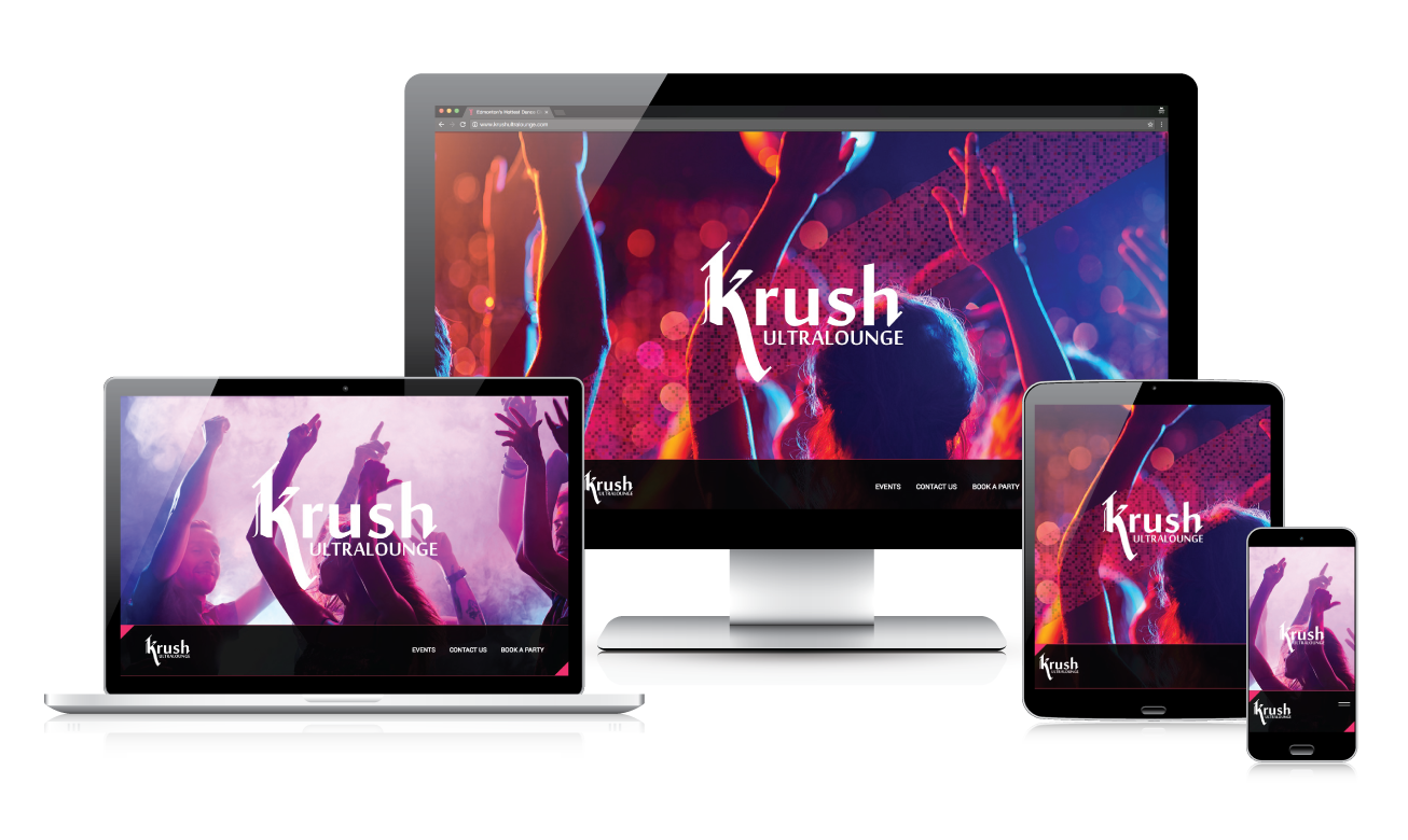
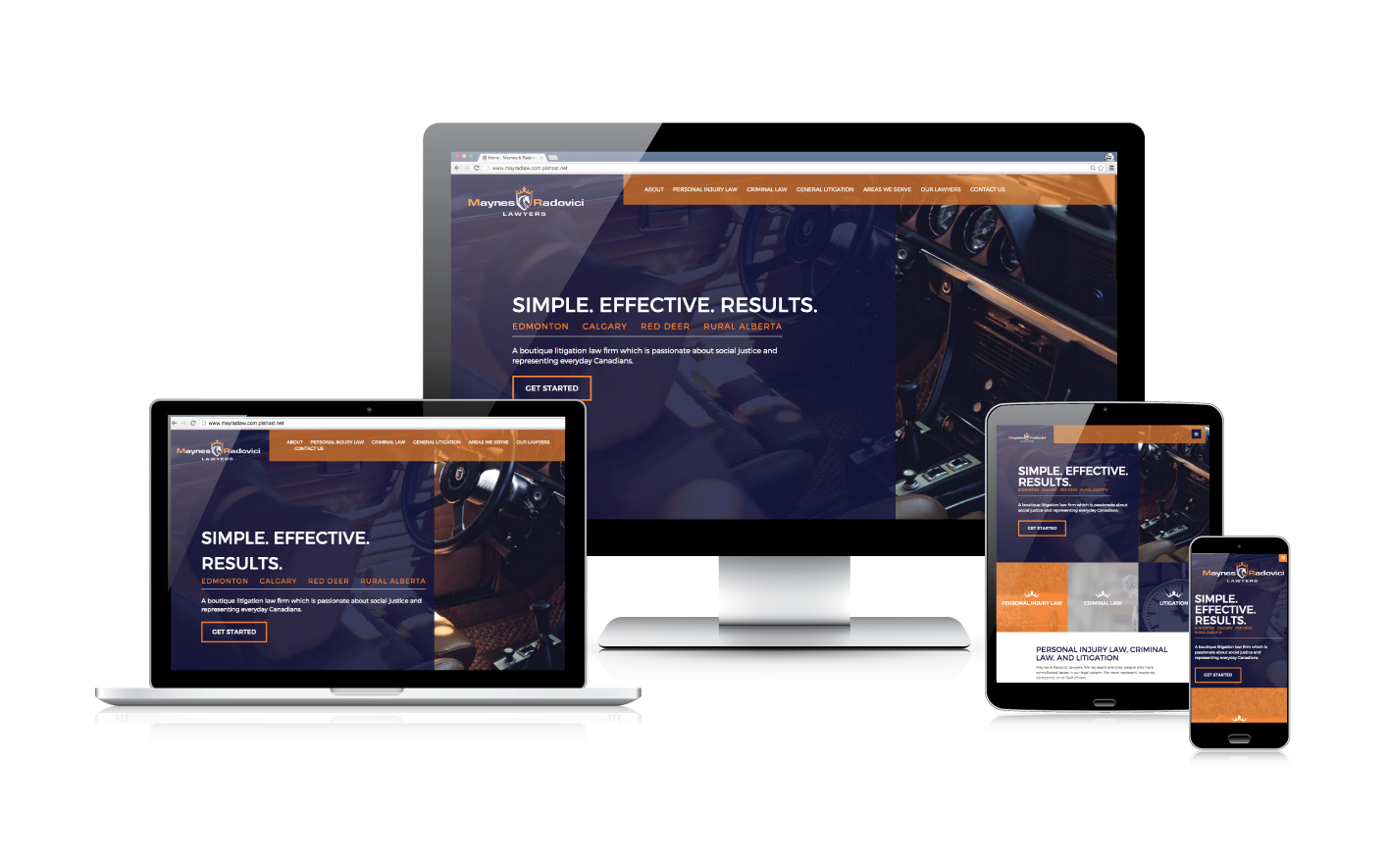
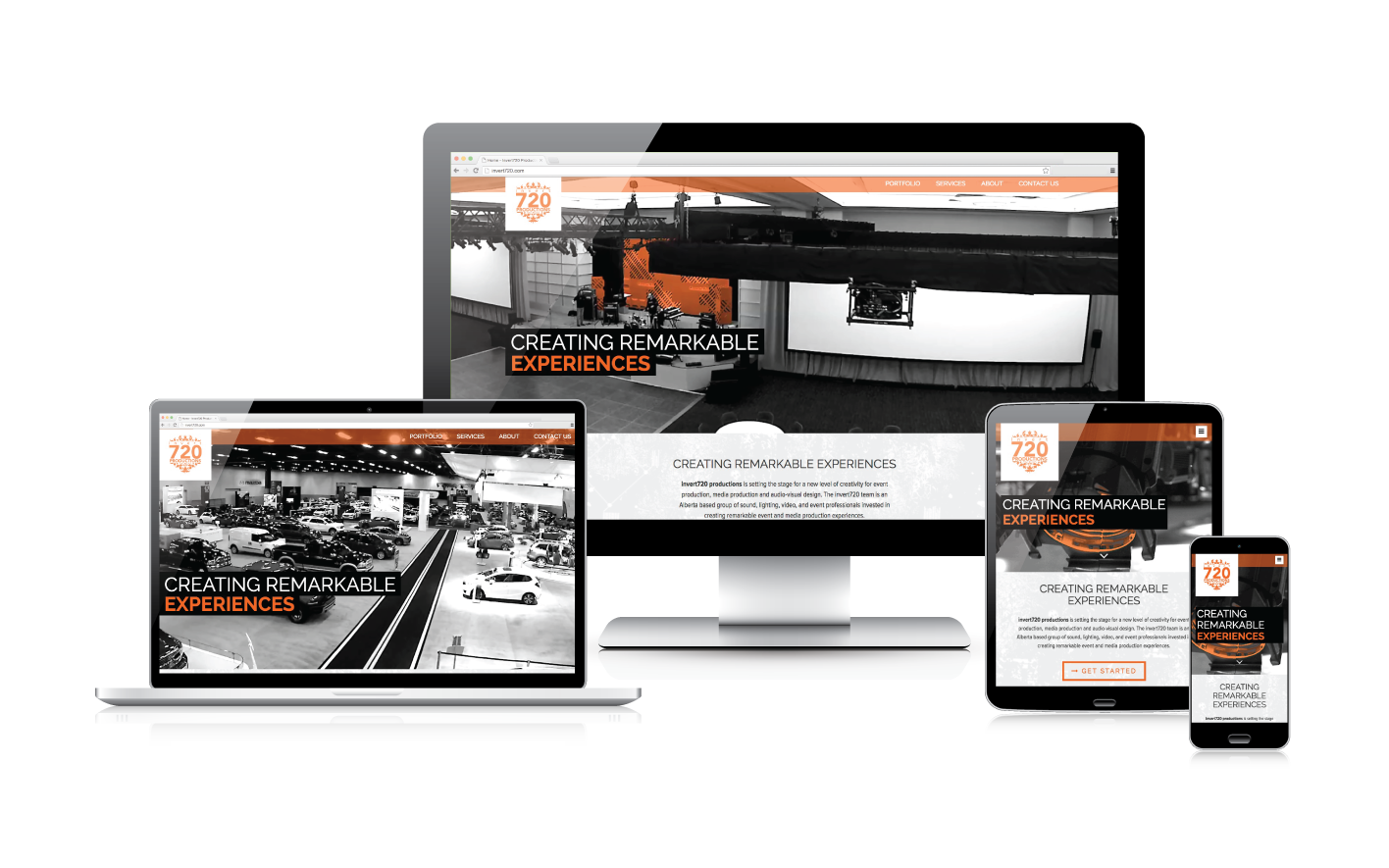
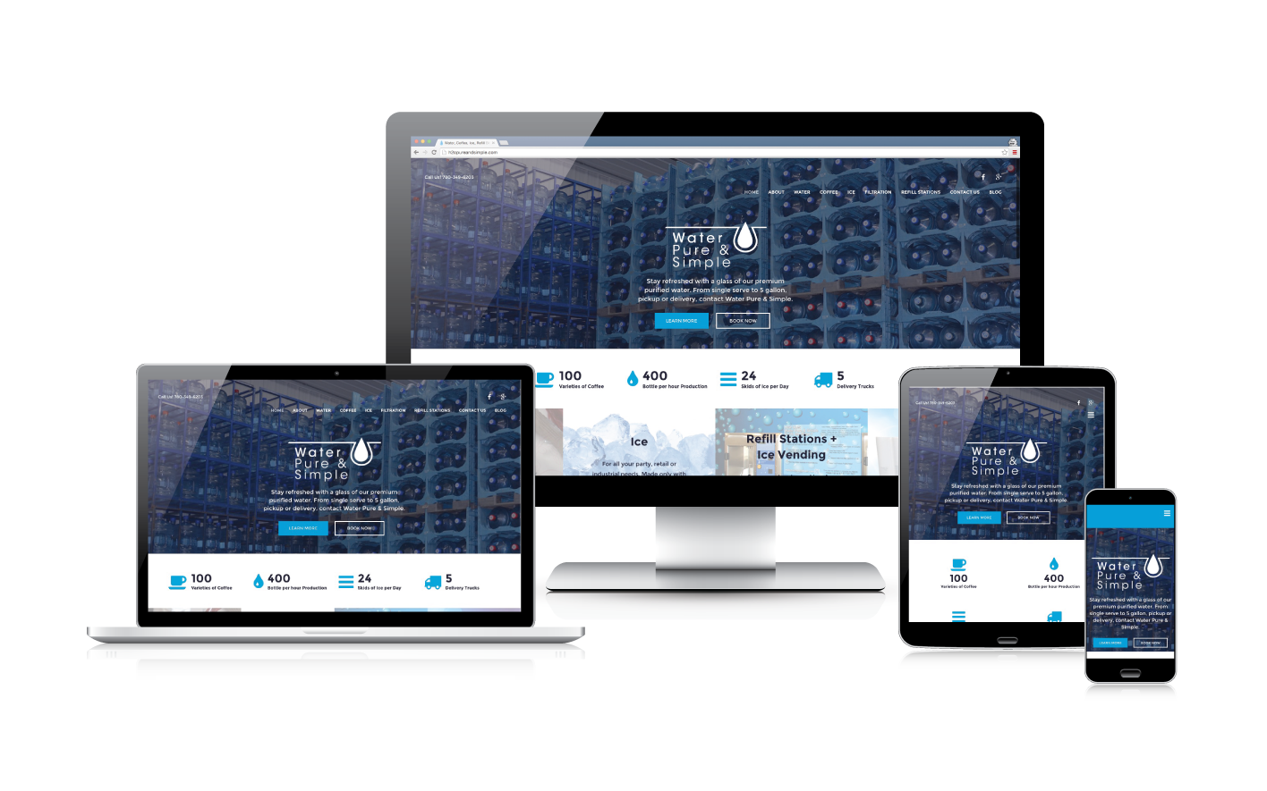
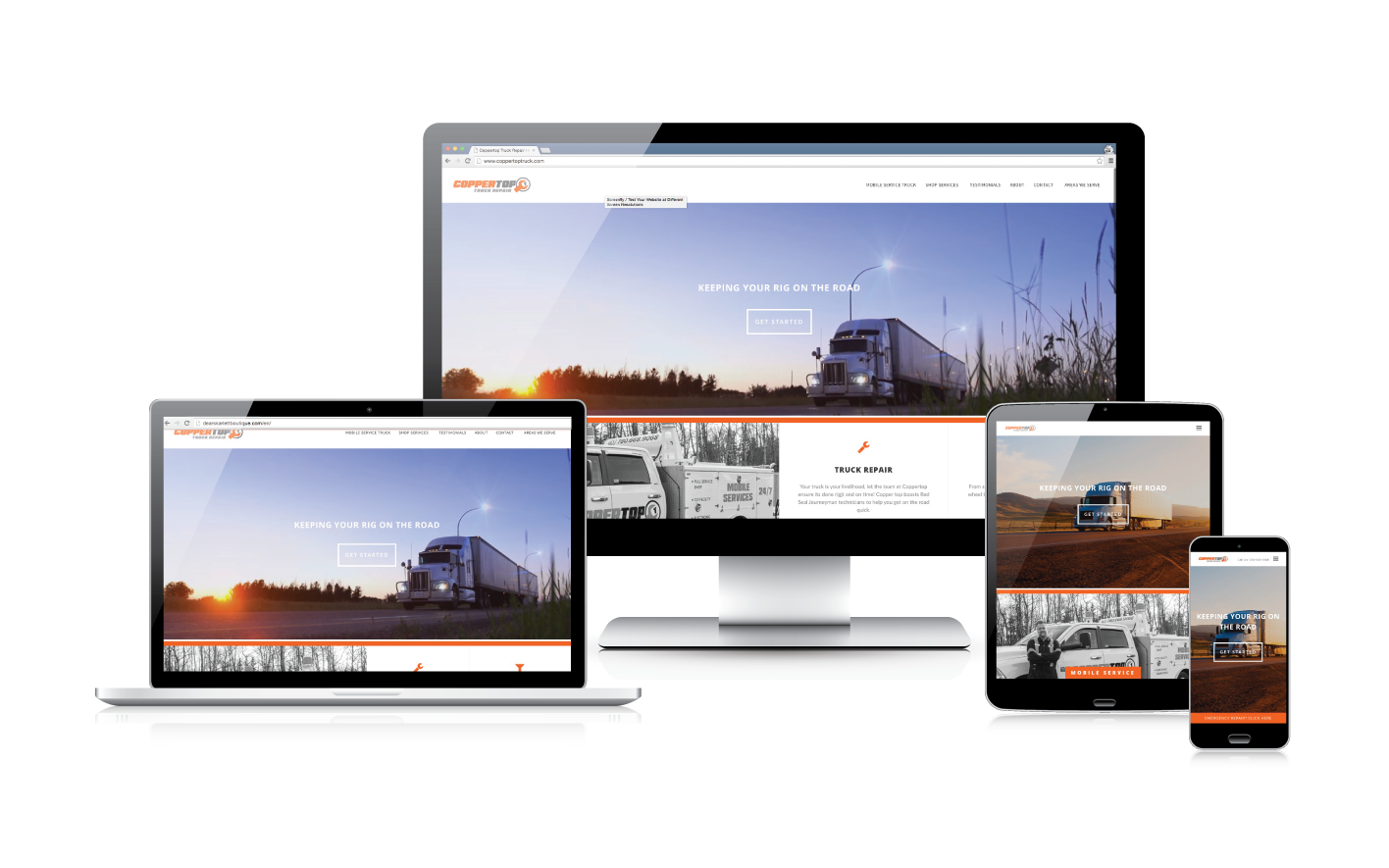
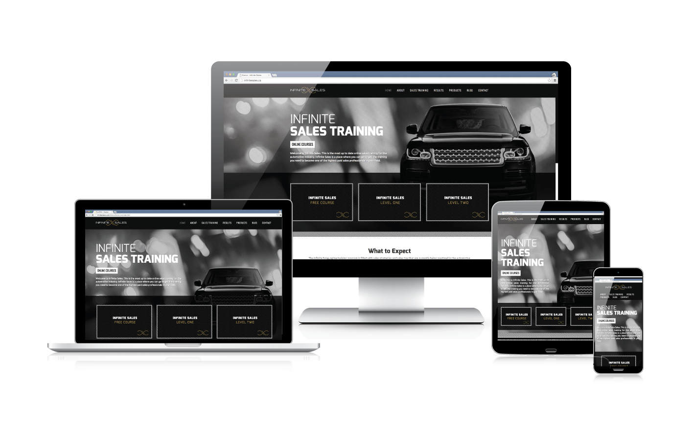
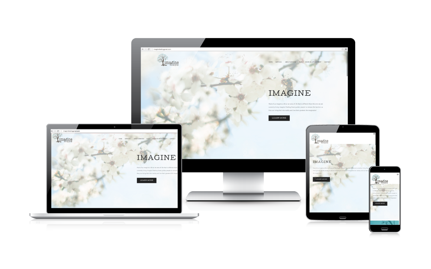
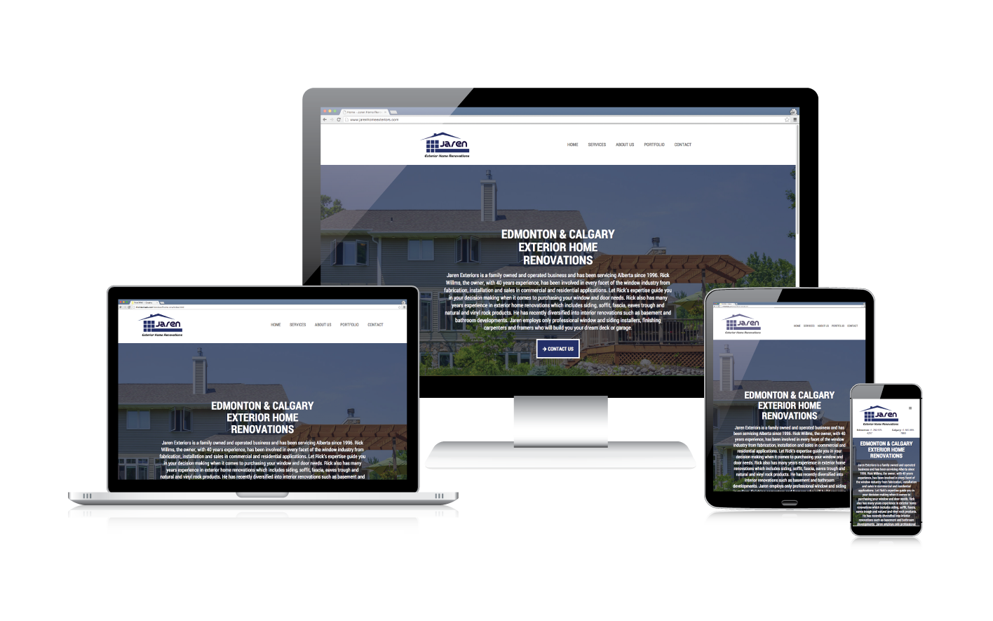
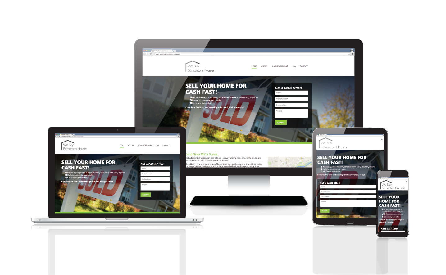
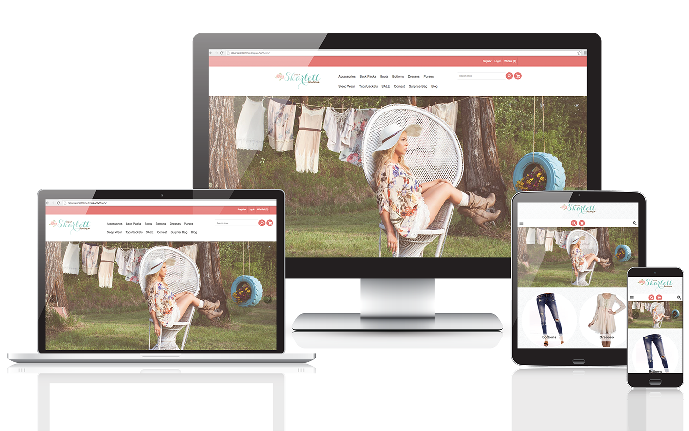
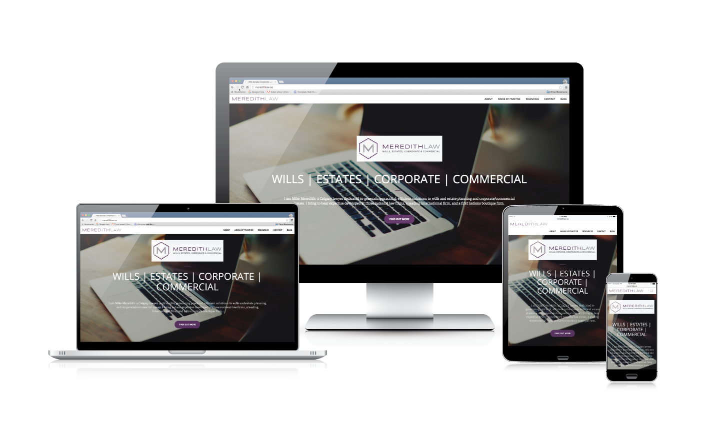
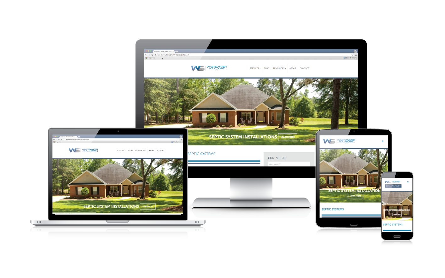
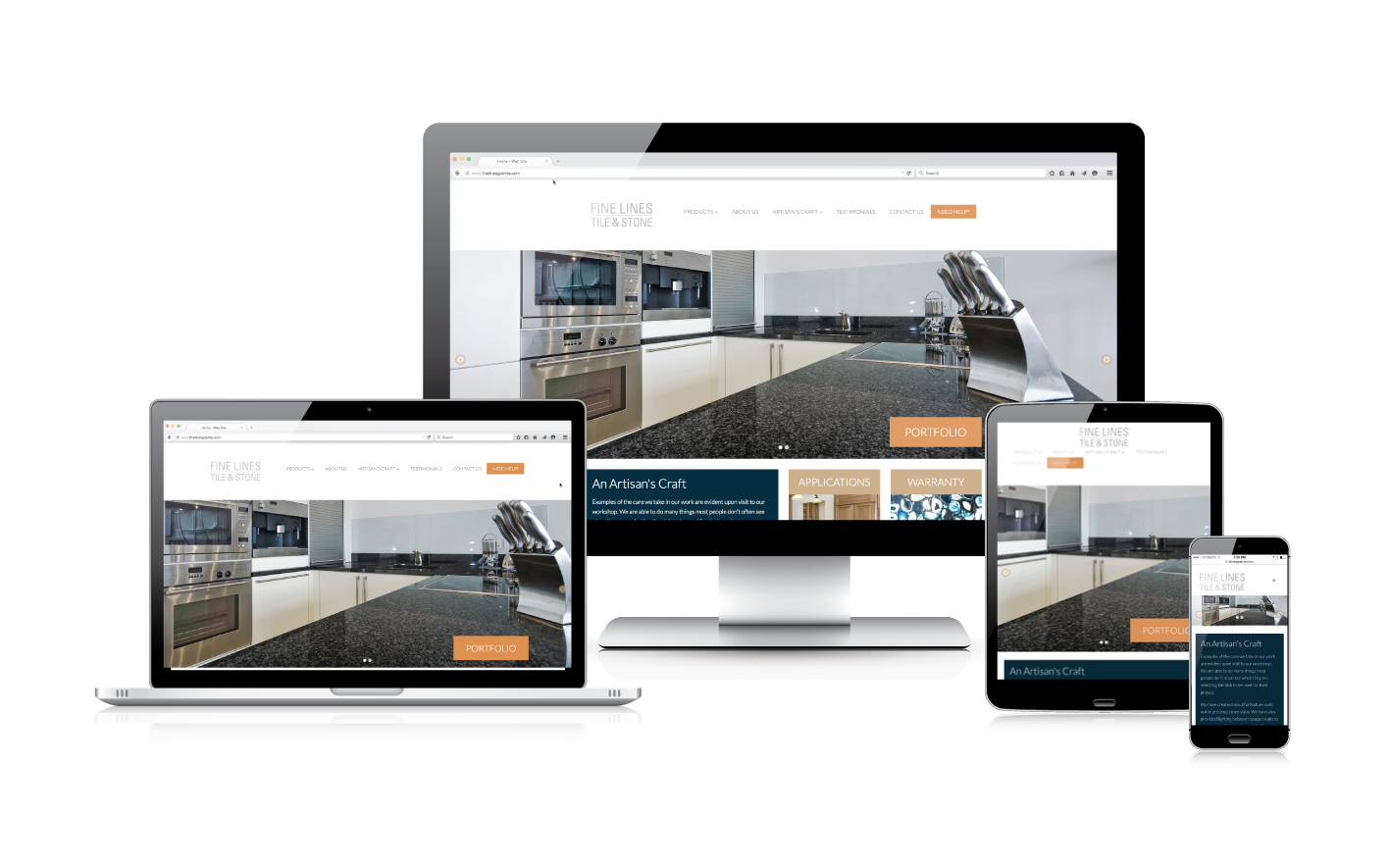
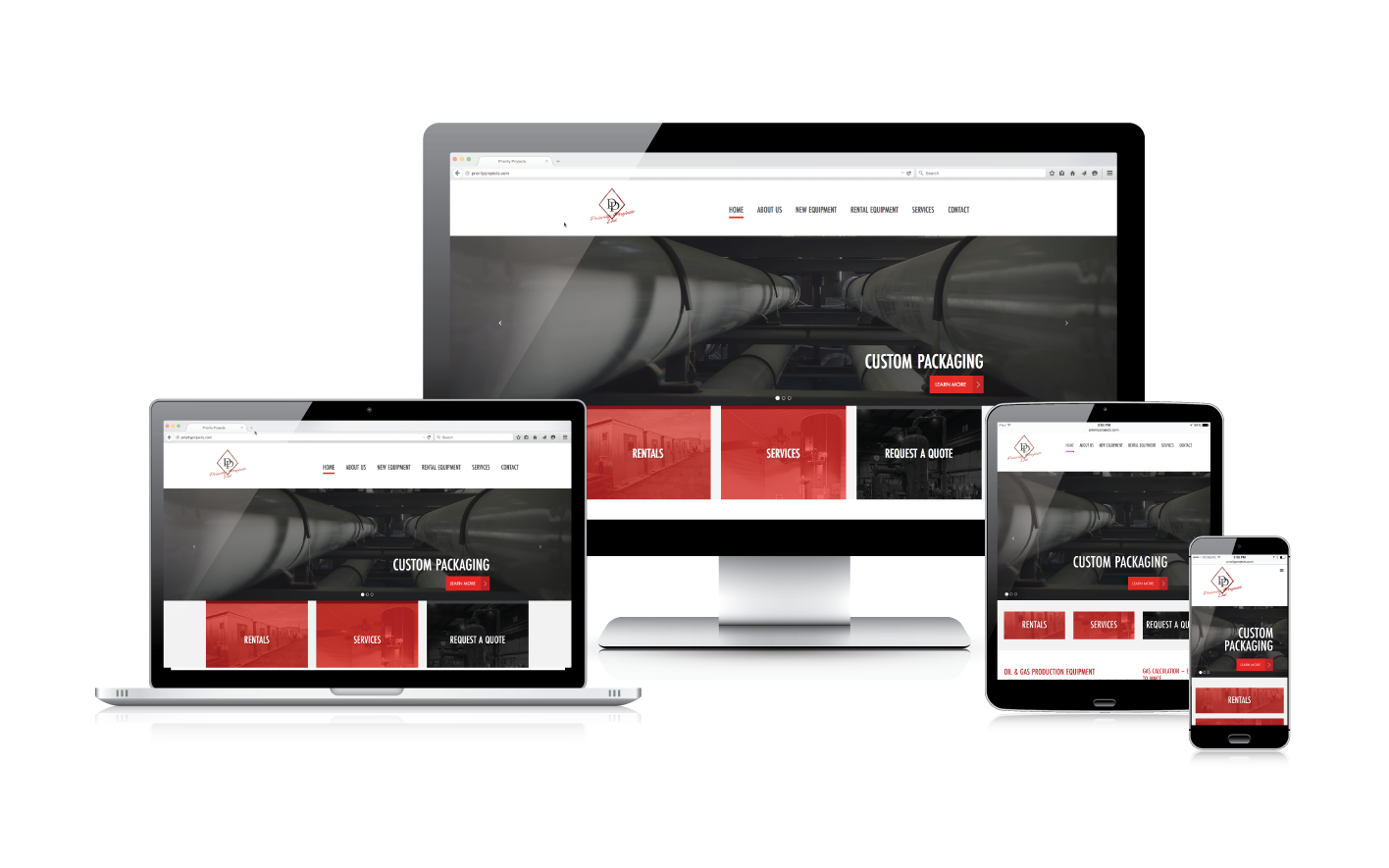
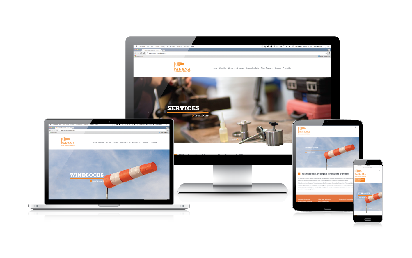
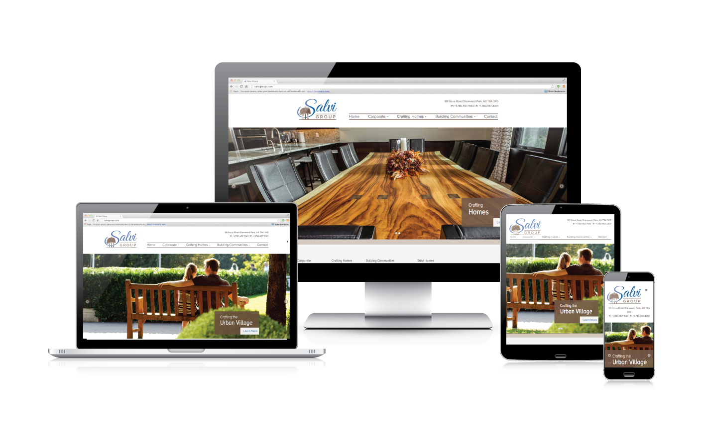
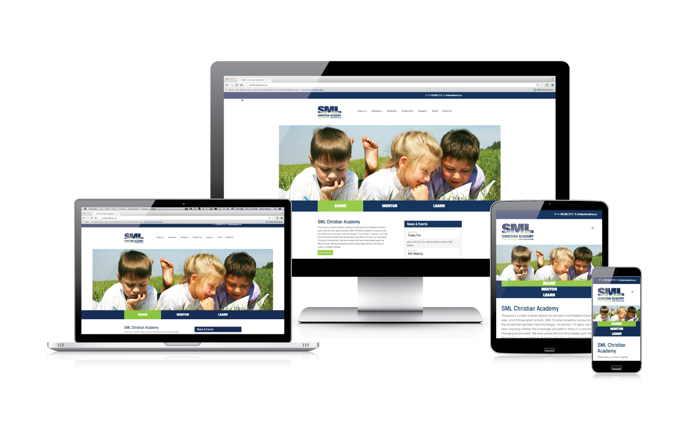
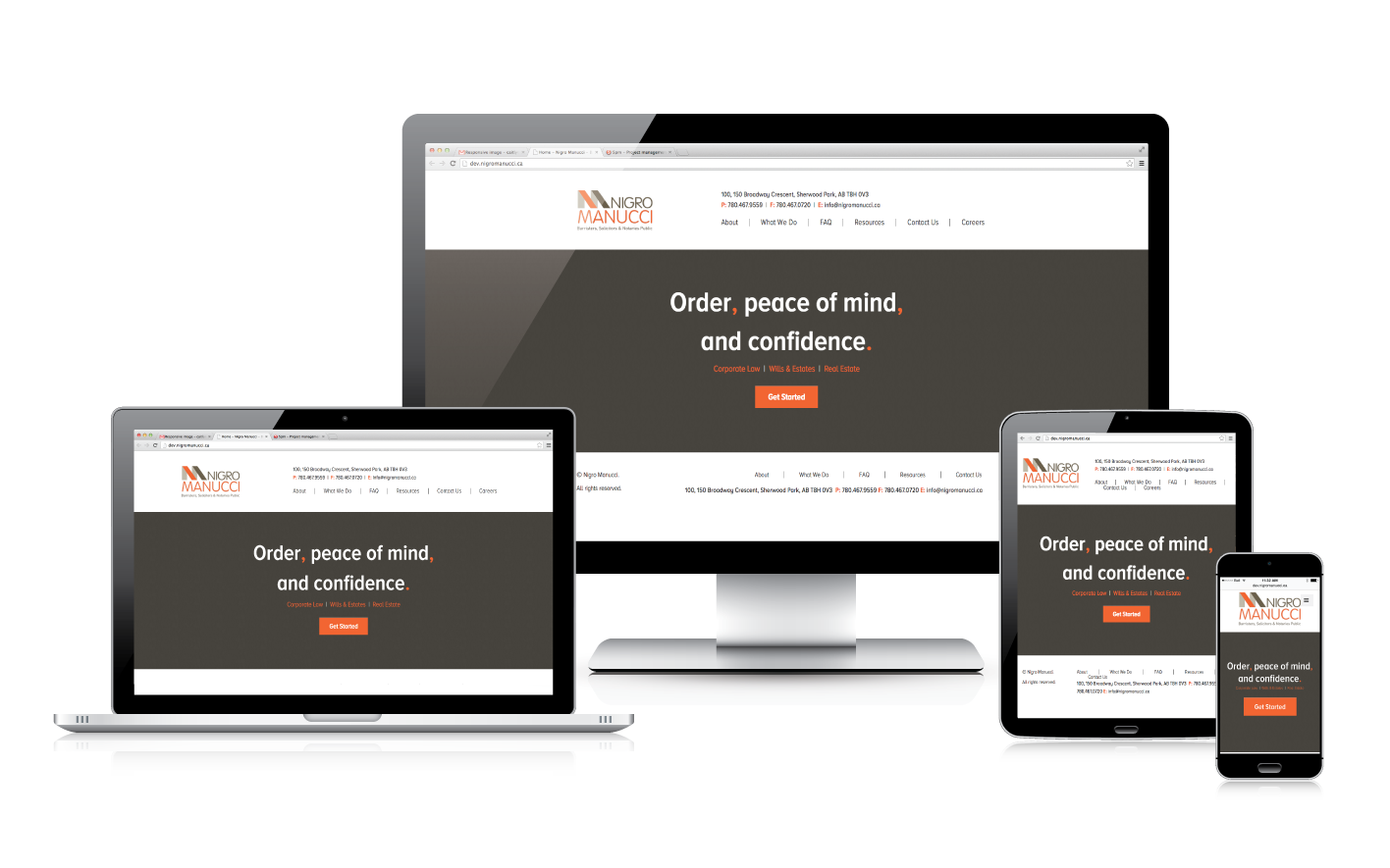
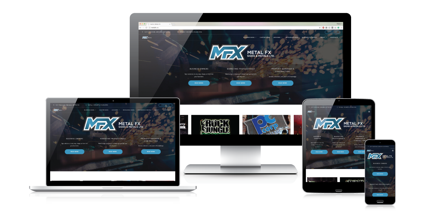
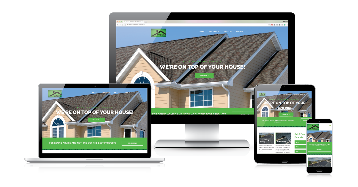
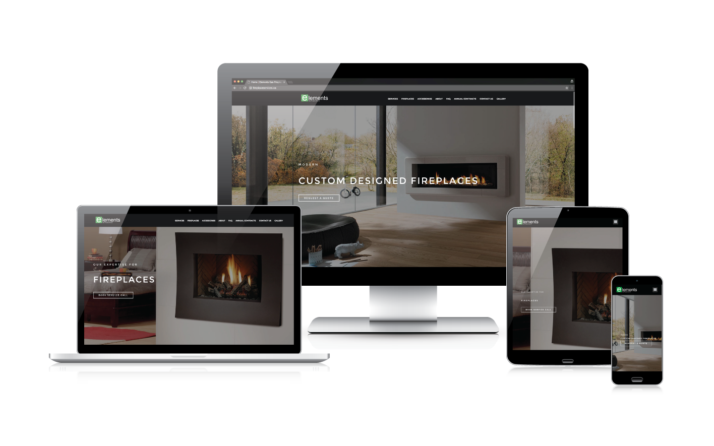
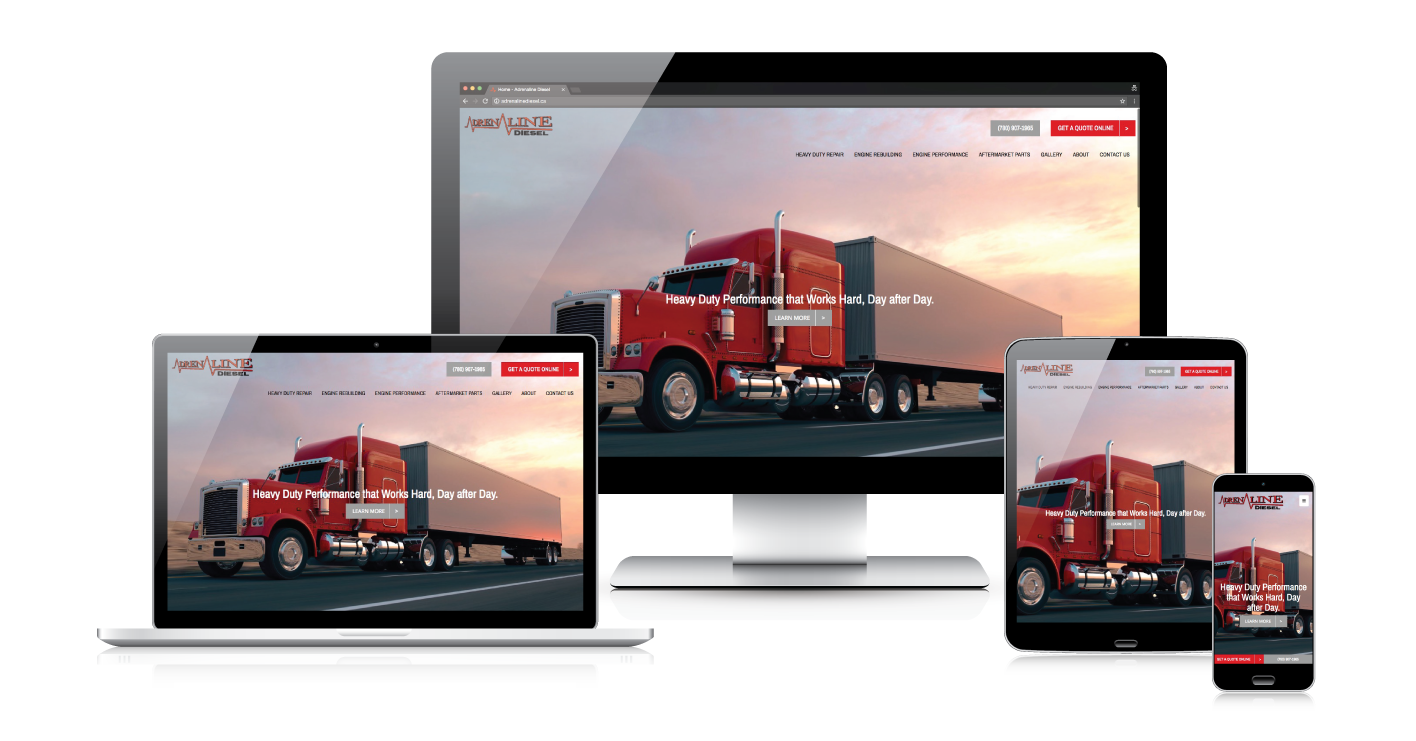
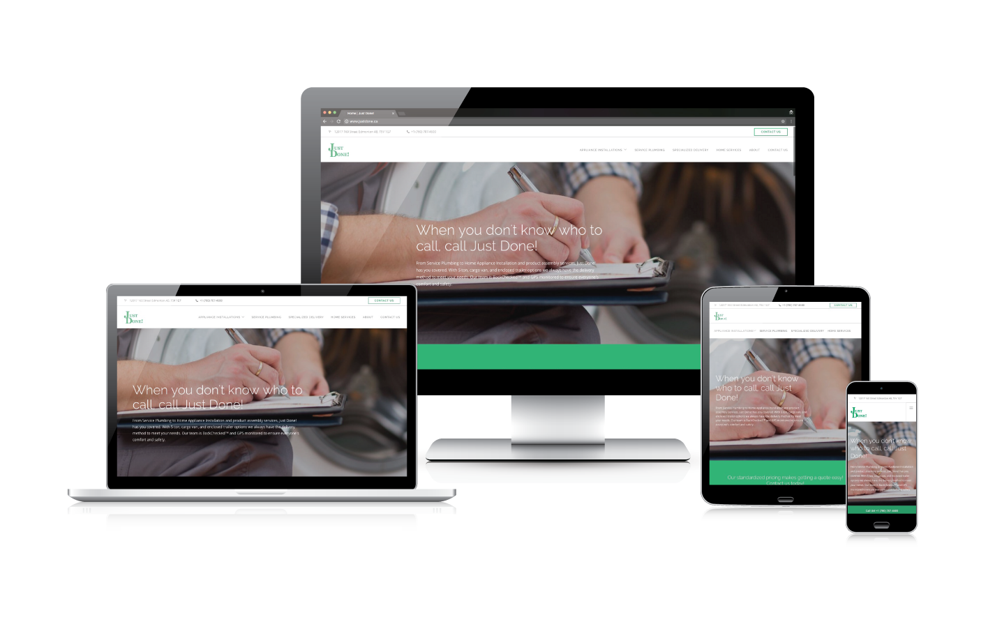
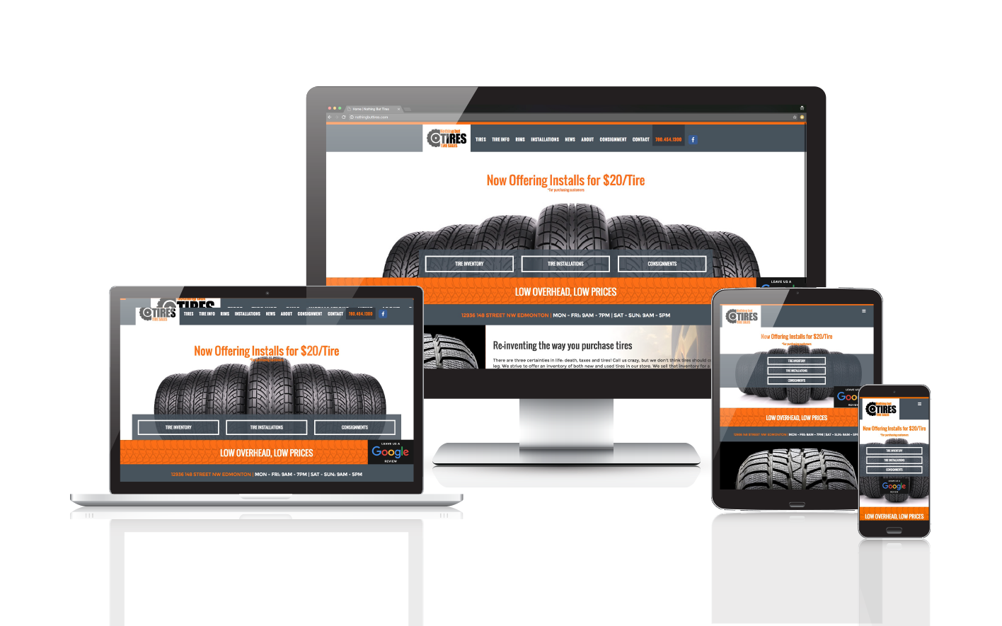
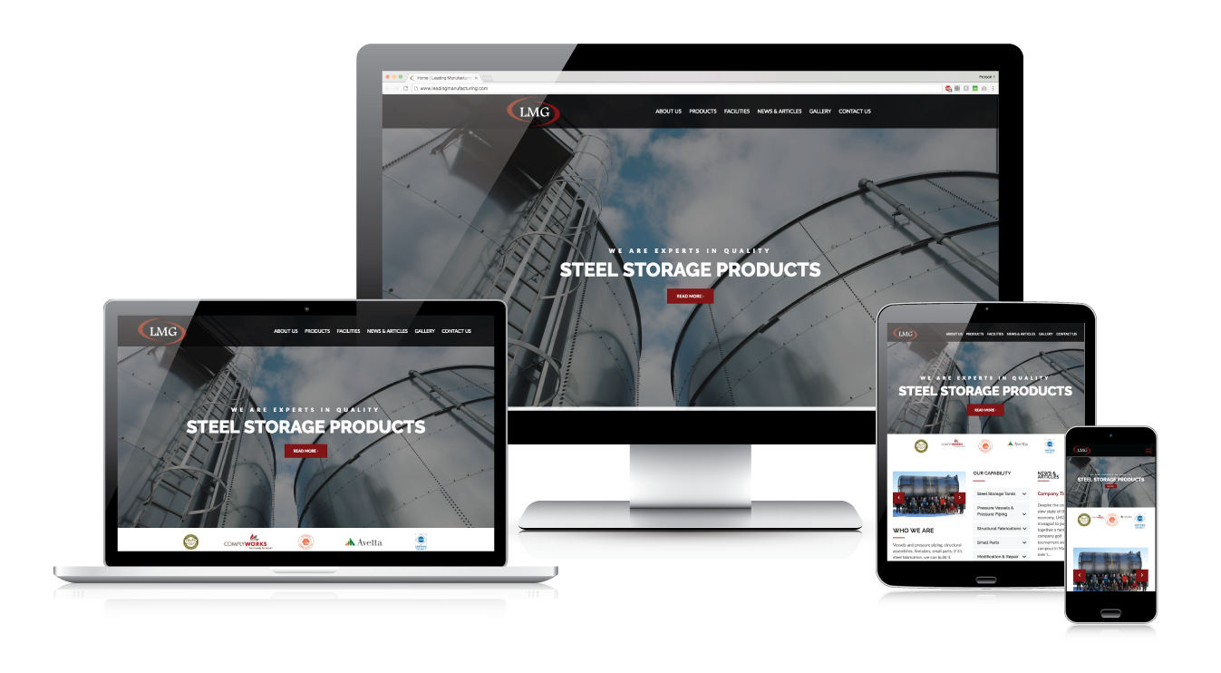
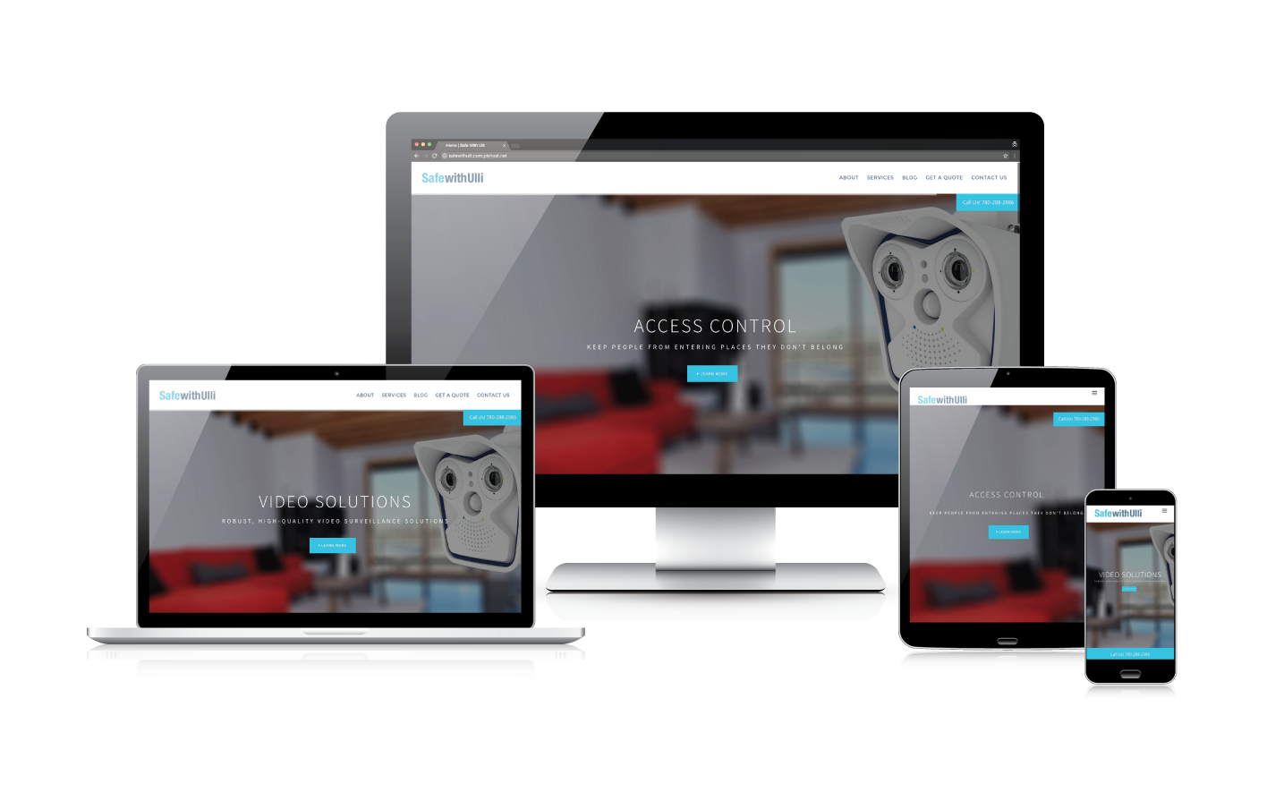
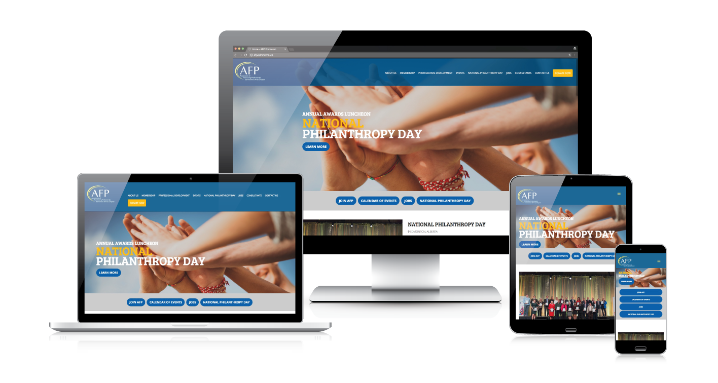
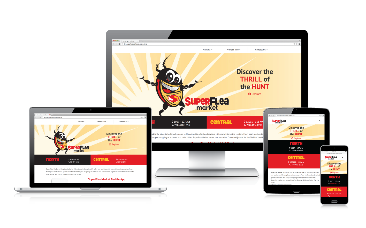
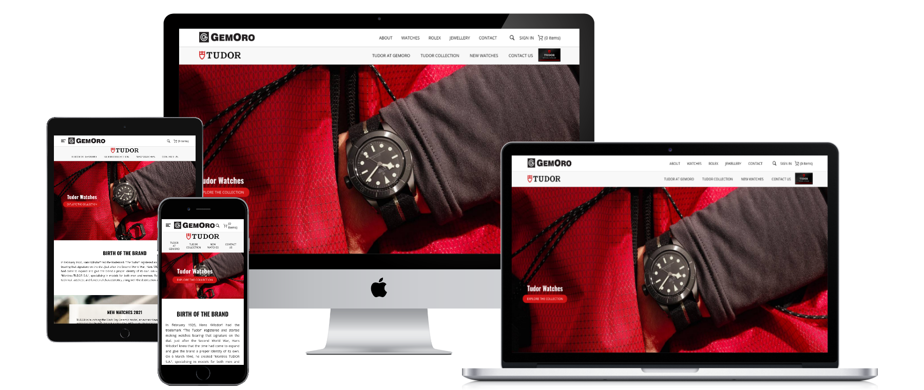
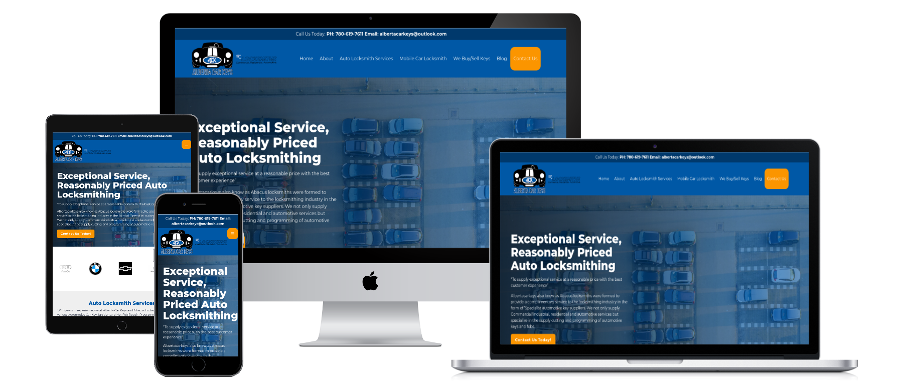
Responsive Web Design
Mobile Friendly Website Design Means More Conversions
How do you get more leads?
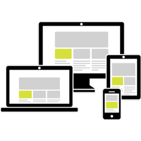
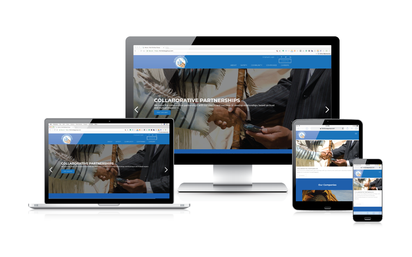
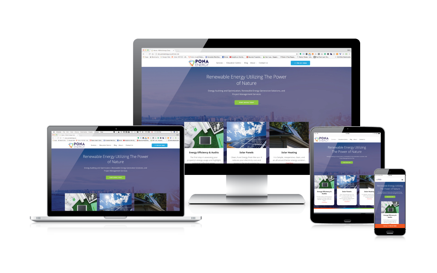
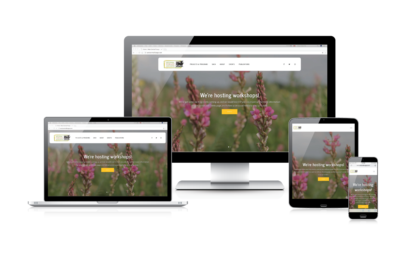
Now more than ever your target audience is researching interests and making buying decisions on mobile devices. Our websites are built using Responsive Web Design methods, providing you with a website that automatically adapts to fit your audience's device no matter what size the screen is. We create one single site that works on smartphones, tabets, laptops, desktops, and any devices in between! Regardless of what device your audience views your site on, they'll be able to easily consume your content and:
- Book an appointment
- Fill out a form
- Call your office

What is Responsive Web Design?
Responsive web design refers to ability of a website's layout to adapt to fit the screen of various devices including smartphones, tablets, laptops, and desktop computers. This ensures that the most important information on your website can be viewed effectively on any screen size, elimiating the need to have a mobile-dedicated site in addition to a regular, desktop-dedicated site.
5 Reasons to Have a Responsive Website
1. More people use mobile phones than desktops. People are always on their phones. In fact, over 60% of web searches worldwide happen on mobile devices. If more than half of your potential audience is using their phones, shouldn't you want to give them the best possible browsing experience. The fact of the matter is that if your site is slow, clunky, and hard to navigate web users will abandon it right away and go elsewhere.
2. There is only one site to maintain. The older approach was that companies would make 2 different sites; one for desktops and one for mobile devices. The problem here is that any time you want to update your content, you have to do it twice. Responsive web design gives you the advantages of having a mobile site, without the extra work and added time to maintain it.
3. It's good for your organic SEO. One of the more recent updates to Google's search algorithm in 2015 had to do with whether or not sites were mobile-friendly. Those that weren't mobile friendly risked losing their place in Google's mobile search results. As more of the web audience flocks to their mobile devices, Google and other search engines continue to place more weight on mobile-friendliness.
4. Target users ready to take action immediately. People using their mobile phones are more likely to be searching for an immediate want or need. Up to 55% of mobile users make a purchase within an hour of browsing and up to 84% make a purchase within a day. To become part of these heavy hitting statistics, your website needs to be ready to serve customers on their mobile devices.
5. It puts your online presence into the present-day. From the facts above it's easy to see that mobile devices are hugely important for a business' online presence. Designing a website that didn't cater to these trends would be like buying a corded landline phone for your home instead of a cell phone. It sort of works, but it has its limits. While you can choose to create or maintain a site that isn't mobile-friendly, the fact is that you are limiting your reach and potential by doing so.
Responsive Web Design Explained
Top Questions to ask Before Picking a Web Design Company
Edward Langer Marketing's Website Development Process

Research
Edward Langer Marketing & Design Inc. will begin every project with a desire to understand the ideal audience or audiences and what success looks like. We want to understand your organization's objectives and how those objectives align with your offerings, products, and services. In the Research Phase, we will discuss with you the scope of products, services, and functionality to determine what categories of content will need to be presented, what information we should attempt to capture from users, and how we will measure that the project is a success.
Planning
Next is the Planning Phase. In this phase, we work to create a well-organized site structure plan that accounts for all content factors. It is imperative that these audience members are able to find information that is relevant to their interest using the least number of clicks to get there. The firt result of the planning phast will come in the form of a sitemap – in essence it we be presented like an organizational (org) chart of the site showing the hierarchy of pages. This helps us all visualize which page any given scenario of content will be placed.
After the sitemap is agreed upon, we work on the creation of wireframes – sketches of the various page layouts needed to accommodate the various types of content gathered in the Research Phase. This sketch places an assortment of elements within the length of each type of page. Once the sitemap has been reviewed and approved, we will work together with you to prepare a Content Strategy – a document that will guide you and your team in creating or gathering all of the content and images needed to bring the site to life as an interactive and engaging marketing tool. While the other phases continue, your team can work on assembling the text and images needed to bring the site to life.

Design
In the Design Phase, we will take the form of the wireframes and apply the colours, textures, logos, and treatments that will communicate the brand of your organization. The result with be mockups of all the various types of pages needed to present the content of the site. These templates will be reusable tools to create any future pages, similar in content structure to pages created during the development of the site. The mockup will be an image of the site to come and will be viewed through a desktop browser – a static representation of what is to come.
Development
In the Development Phase, we will convert these mockups into web code using standard languages like HTML, JavaScript, and CSS. We will connect those front end elements to the Content Management System in a way that offers you’re the client the ability to easily maintain content. Care will be taken to make this Content Management System interface as straightforward and easy to use as needed.
Content
Once the system is ready to receive real content, we will be looking to you and your team for all of the text and images mentioned in the explanation of the Planning Phase. Our team will organize all of the photos, diagrams, charts, and icons in a proper folder structure so that they are easy to find and re-use. The Edward Langer Marketing crew will also enter all of the text that you provide into the Content Management System applying the formatting that the mockup demonstrated.
Testing & Launch
All sites that we build are mobile friendly, meaning one web site for all devices. In the Testing Phase, we test on smartphones, tablets, laptops, and desktops of varying screen sizes to ensure that the content automatically adjusts to fit the constraints of the screen size with no pinching and zooming just to read text. We also use a variety of browsers to verify that there are no issues with the way that the browsers respond to the code. This involves testing every page type on many devices.
We will also inform Google of the launch of your new site using Google Search Console. In this process, we provide Google with a coded version of the sitemap, ensure that its Googlebots have access to all of the same resources that a user's browser would have, and request that the site be indexed.


